The Physics of Fables: Graphing the Tortoise and the Hare’s Hidden Science
I’m Ken Kuwako, your Science Trainer. Every Day is an Experiment.
The fable of “The Tortoise and the Hare” is one we all heard as children—a race between the quick-footed hare and the slow-but-steady tortoise. But did you know that when viewed through a “scientific lens,” this story becomes an excellent teaching tool for understanding the laws of motion? This time, let’s analyze this famous race using two different types of graphs. You’ll be surprised by the scientific fun hidden beneath the simple narrative.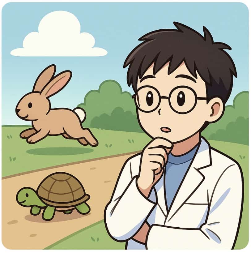
“Visualize” Motion with Graphs
To truly understand how an object moves, a graph is far more effective than a verbal description. In the world of physics, motion is often represented using two primary types of graphs:Position-Time Graph ($x$-$t$ graph): Shows how the object’s position changes over time.Velocity-Time Graph ($v$-$t$ graph): Shows how the object’s speed (velocity) changes over time.So, what shape would the graph of the Tortoise and the Hare’s race take? Take a moment to draw and visualize it yourself.The Hare’s graph would be quite dramatic: a sharp increase in speed right after the start, then a sudden drop to zero speed when it takes a nap, and finally, a frantic burst of speed at the end. In contrast, the Tortoise’s graph would be a low, flat, single line, showing that its speed remained constant from start to finish. The distinct personalities of the two competitors are clearly reflected in the shape of their graphs!
The Secret Hidden in the “Area”
Let’s introduce a slightly more advanced concept here. A fascinating mathematical property is hidden within the velocity-time ($v$-$t$) graph. The area enclosed by the velocity-time graph line and the horizontal axis (the time axis) represents the object’s Total Distance Traveled.This insight is a huge hint for sketching those graphs!At first glance, the Hare’s graph and the Tortoise’s graph look completely different. However, if you consider the total time it took for each of them to reach the finish line, the area under both graphs (the distance traveled) must be identical. Why? Because both the Hare and the Tortoise covered the exact same distance from the start line to the finish line.
The Fun of Scientific Storytelling
“Different shapes, but the same area.” This mathematically proves that no matter how fast you run, if you stop along the way, you will only cover the same distance as an opponent who proceeds slowly but steadily. When you translate a familiar story like this into graphs, doesn’t it make a simple tale look like an introduction to concepts like “vector addition” or “integration (area calculation)”? Try graphing other stories or everyday movements to uncover the scientific laws hidden behind them!
Contact and Requests
Bring the wonder and fun of science closer to you! I’ve summarized easy, enjoyable science experiments you can do at home, along with tips. Feel free to search around!・The content of my Science Idea Book is now available as a book. Details here・For information on the operator, Ken Kuwako, click here・For various requests (writing, lectures, experiment classes, TV supervision, appearances, etc.), click here・Article updates are distributed on X!
![]() The Science Idea Channel streams experiment videos!
The Science Idea Channel streams experiment videos!
NEW 分解問題集 理科
- 7月21日発売!『高校入試 分解問題集 理科』(学研)…難しい問題も小さな問題に分解することで、問題を解くことができます。そんな分解の技術が身につくように深く関わりを持って作りました。
7月のイチオシ実験!
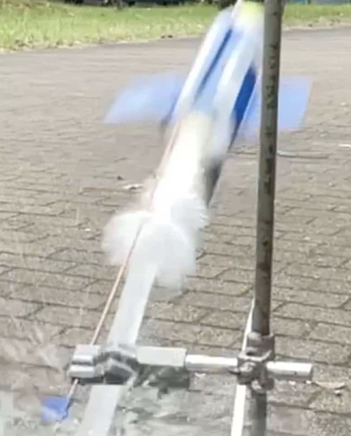
夏でプシュッと爽やか実験!
テレビ番組監修・イベント等のお知らせ
- 7月18日(土)「TIF presents ONE SONG FES. 」(フジテレビ)
- 7月18日(土) 教員向け実験講習会「ナリカカサイエンスアカデミー」
- 7月23日(木)科学監修 19:00〜 THE突破ファイル(日本テレビ)
- 7月30日(水) 監修したテレビ番組放送予定
- 12月26日(土) ナリカサイエンスアカデミー(教員向け実験講習会)開催
書籍のお知らせ
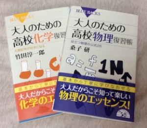
- 『大人のための高校物理復習帳』(講談社)…一般向けに日常の物理について公式を元に紐解きました。特設サイトでは実験を多数紹介しています。※増刷がかかり6刷となりました(2026/02/01)
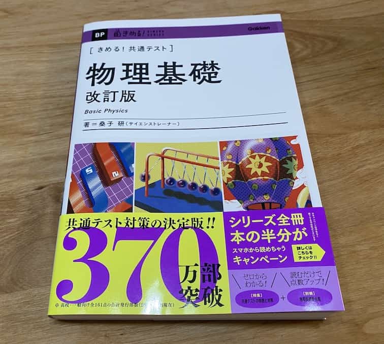
- 『きめる!共通テスト 物理基礎 改訂版』(学研)… 高校物理の参考書です。イラストを多くしてイメージが持てるように描きました。授業についていけない、物理が苦手、そんな生徒におすすめです。特設サイトはこちら。
各種SNS(更新情報をお届け!)
【日本語】X(Twitter)/instagram/Facebook 【英語】BlueSky/Threads
Explore
- 楽しい実験…お子さんと一緒に夢中になれるイチオシの科学実験を多数紹介しています。また、高校物理の理解を深めるための動画教材も用意しました。
- 理科の教材… 理科教師をバックアップ!授業の質を高め、準備を効率化するための選りすぐりの教材を紹介しています。
- Youtube…科学実験等の動画を配信しています。
- 科学ラジオ …科学トピックをほぼ毎日配信中!AI技術を駆使して作成した「耳で楽しむ科学」をお届けします。
- 講演 …全国各地で実験講習会・サイエンスショー等を行っています。
- About …「科学のネタ帳」のコンセプトや、運営者である桑子研のプロフィール・想いをまとめています。
- お問い合わせ …実験教室のご依頼、執筆・講演の相談、科学監修等はこちらのフォームからお寄せください。